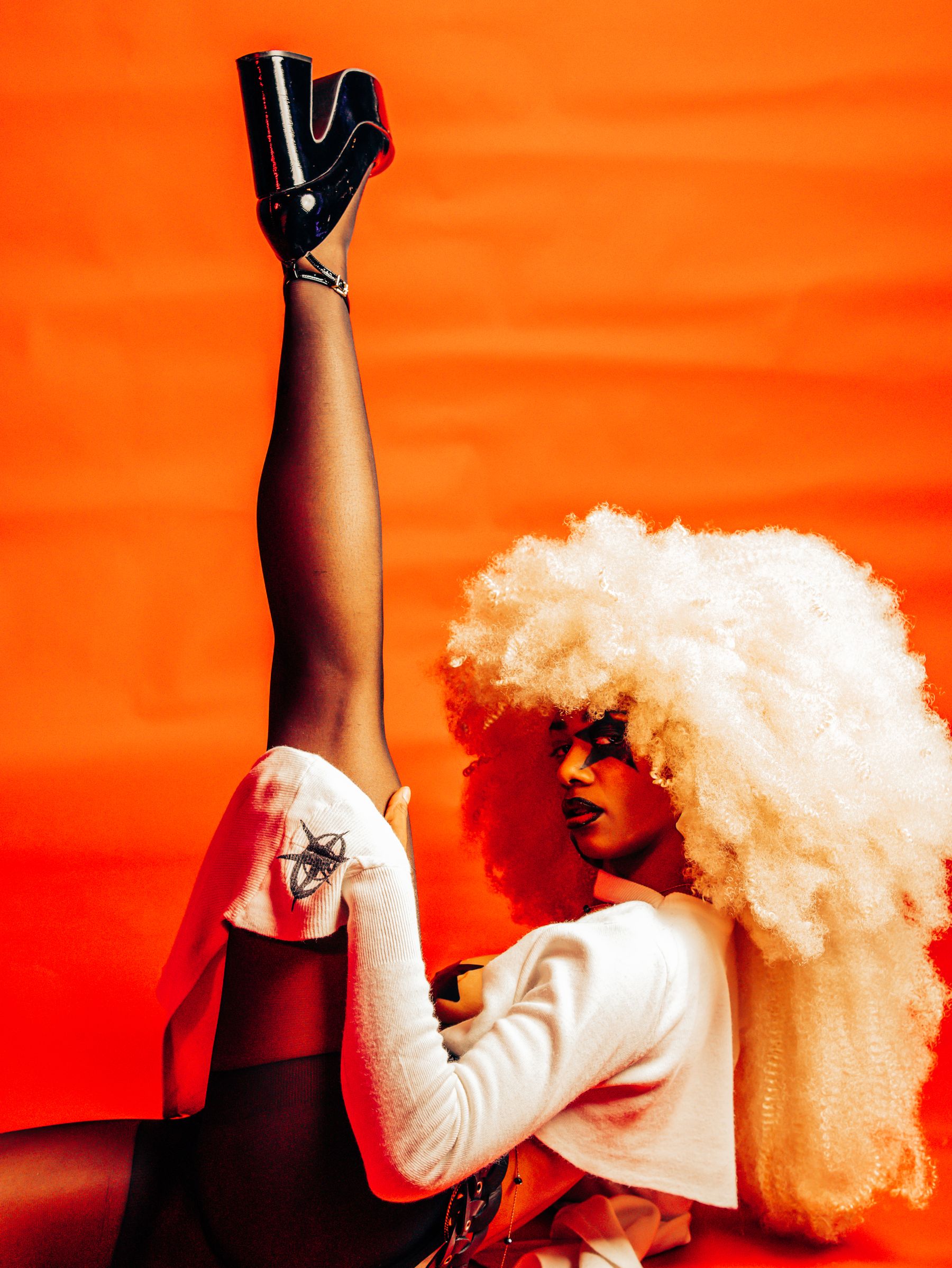
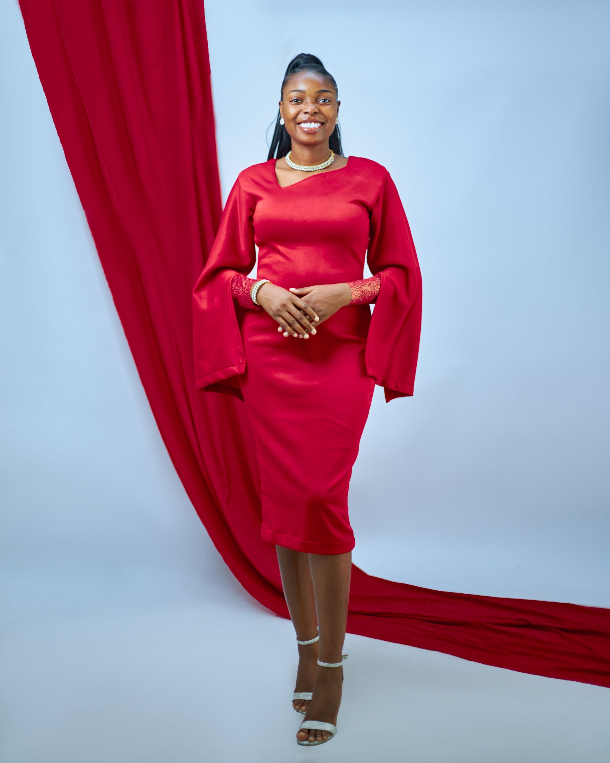
Fashion images are done behaving politely. Lava-red dresses against pink walls. Teal gloves with orange tailoring. Purple shadows where skin would usually be lit beige. The point isn’t realism. It’s instant drama.
In a feed, color can do in half a second what a long caption cannot. It sets the mood and gives your thumb a reason to stop. Pantone’s Spring/Summer 2026 New York Fashion Week report called the palette an answer to AI and “creeping homogenization.” Put intense red next to saturated teal and quiet neutrals, and the logic clicks. Theatrical color works best when one shade gets to misbehave.
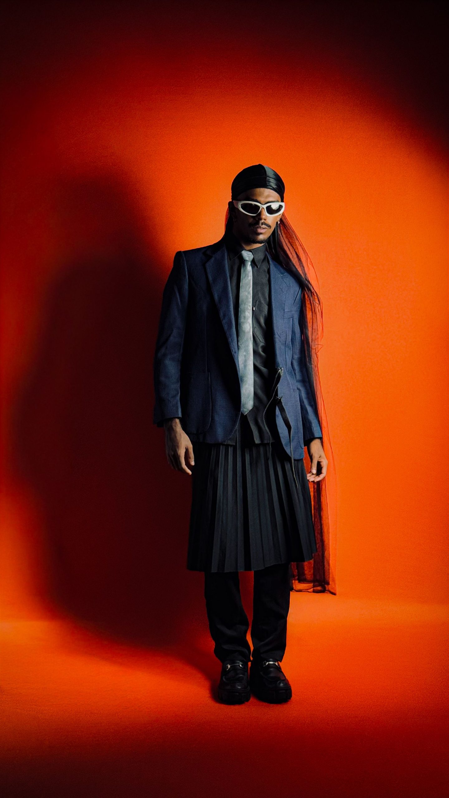
Why now? Because polished images are easy to produce and just as easy to forget. Exaggerated color puts human taste back in the frame. A simple coat can feel villainous, romantic, futuristic, or all three before the next swipe.
This doesn’t mean throwing neon everywhere. The best images have one bold palette, one clear mood, and no apology. Fashion isn’t asking color to look natural. It’s asking color to be impossible to forget.