
It should have been over
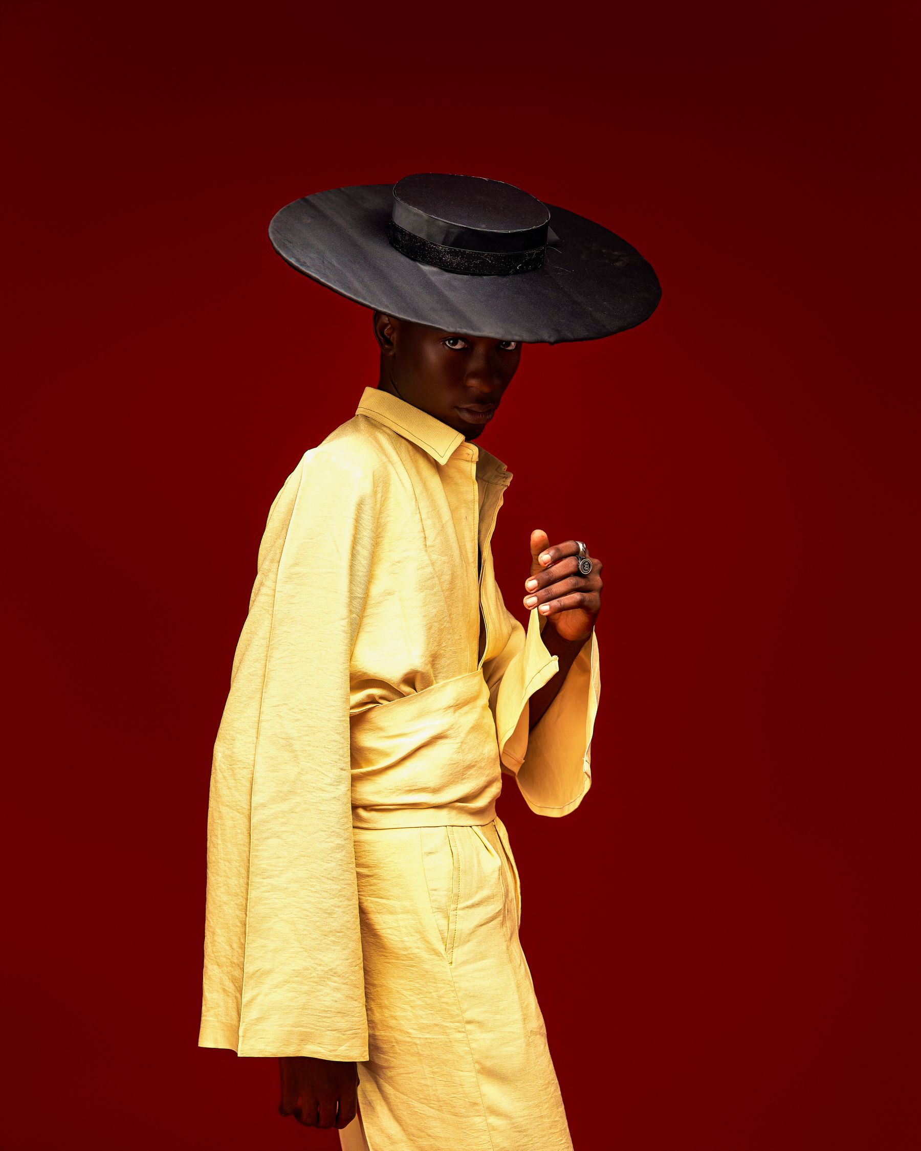
I thought butter yellow had peaked. It was everywhere last summer and close to becoming wallpaper. Fashion did the unexpected: it kept the color, dropped the sweetness, and made it sharper.
This is not a one-season fling
The evidence is unusually solid for a color trend. Pantone placed Pale Banana 12-0824 in its London Fashion Week Spring/Summer 2026 report. Vogue then tracked butter yellow across Loewe, Chloé, Alberta Ferretti, Louis Vuitton and Chanel. By fall, the shade was still showing up at Dior, Kallmeyer, Tod’s, Conner Ives and Chloé. That is not a one-season fling.

The 2026 switch
The 2026 version is all about contrast and texture. Think pale yellow silk with a black suit, a buttercream shirt with a chocolate-brown skirt, or soft tailoring broken up by something sheer. Even a bag works. What feels dated now is head-to-toe sweetness.
Why it keeps going viral
It photographs brighter than cream but looks calmer than lemon. It can read romantic, expensive, strange or sporty depending on the fabric. My vote: treat pastel yellow like a neutral with a pulse. One strong piece is enough.
Image credits: featured image via Pexels; pastel-yellow dress by Thể Phạm via Pexels; pastel sweatshirts by Ron Lach via Pexels.